Rethinking Asset Panel Design
From Upload Bin to Purpose-Driven Workflow
My role
UX Lead — Interaction Design, Visual Design, User Flows, Rapid Prototyping
Team
Andrew King, PM
Ryan Odd, SWE
Timeline
1 month • Launched February 2025
Impact
30% faster asset selection
Reduced support tickets
Improved creator confidence
Overview
Live sellers relied on our asset panel to run their shows but it worked like a flat upload bin, creating confusion, hesitation, and mistakes during live streams.
Through two iterative phases, we improved clarity with quick wins like file names and reordering, then reorganized the panel by when and how assets are used, surfacing hidden features and reducing cognitive load.
The result? Sellers now prep faster, find assets with confidence, and run smoother, and more polished live shows.
PREVIEW
Image description
IMAGE
Image description
IMAGE
Image description
IMAGE
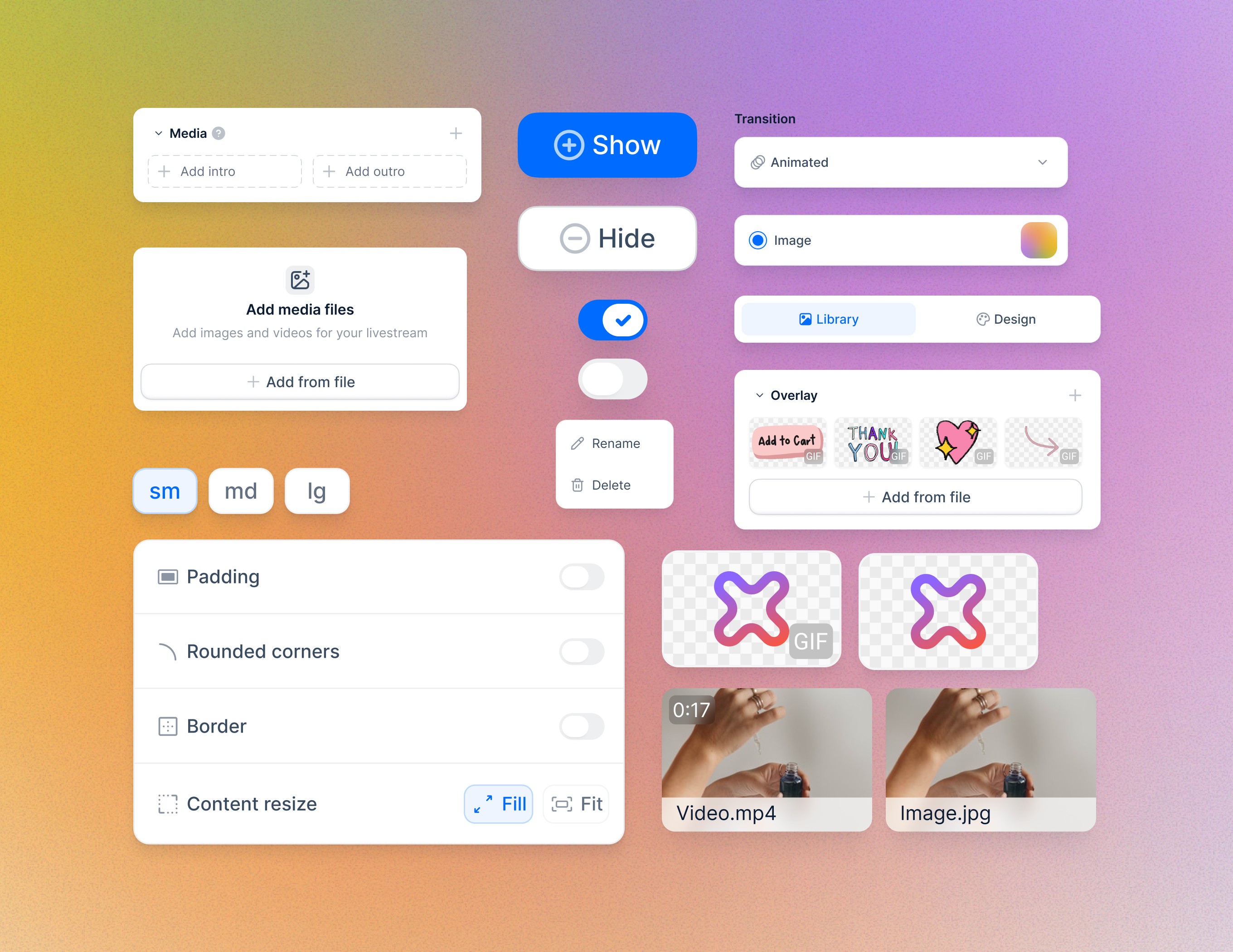
Image description
IMAGE
THE REQUEST
It started with a simple ask.
"Can we just show file names?”
Live sellers were running into the same frustrating issue: during their live shows, they couldn’t quickly tell their assets apart during livestreams. Thumbnails, especially for videos shot in similar settings, looked almost identical. And in the middle of a fast-paced stream, hesitation wasn’t an option.
At first glance, it seemed like an easy fix.

Image description
IMAGE
The current asset panel wasn't built for live selling workflows.
Image description
IMAGE
This setup was functional in the simplest sense. But for live selling—where timing drives engagement and conversion—it created unnecessary friction.
Sellers were losing time mid-show
Without structure or clear identifiers, sellers
Hesitated when assets looked visually similar
Wasted precious seconds searching during live streams
Felt their careful prep work didn’t translate into clarity on show day
Sometimes triggered the wrong asset while live
And in a live selling environment where timing drives engagement, those few seconds could mean 📉 missed sales, 😶 awkward silences, and 😢 reduced viewer trust.
DISCOVERY
Missing file names were just the surface of a deeper problem.
What support tickets couldn’t show us <?>
As we looked closer, we realized this wasn’t just about file names. It hinted at a much deeper disconnect between how the panel was structured—and how sellers actually think when running a live show.
Surface feedback like “Can you just show file names?” only told part of the story. To truly understand the friction, we needed to see how sellers actually worked in the moments that mattered most.
But like any small startup, we faced real constraints:
No dedicated research budget or team. No time for formal usability studies or discovery interviews
A tight shipping timeline. We aimed to deliver improvements in just 3 weeks, so research couldn’t slow us down
Limited developer bandwidth. Any solution we proposed had to be incremental and low-risk
So instead of “traditional” research, we leaned on scrappy, high-signal methods that was already within reach:
Customer support calls with sellers who had reported asset issues
Support ticket analysis to find recurring pain points
And most importantly, observing live streams from a viewer’s perspective
And we saw hesitation in real time: the subtle pause before they triggered an asset, the scanning of the panel as they mentally searched for “the right one,” the fumbling that sometimes led to the wrong clip going live.
<IMAGE HERE>
It wasn’t just about visibility—it was about clarity, confidence, and keeping the show flowing smoothly under pressure.
Image description
IMAGE
INSIGHTS
Users think in roles, not file names
The deeper we looked, the clearer it became that the problem wasn't thumbnails or file names, it was mental models.
Sellers don’t think in file types. Whenever they are referring to a file, they always say "my intro"
Purpose drives behavior. Across different sellers, we saw certain asset roles appeared consistently. Their workflow was built around why an asset existed, not what format it was.
Intro/outro videos
Content clips for demos or testimonials
Overlays for product segments
Branding elements
Upload order mattered as a workaround. Sellers used upload order like a makeshift run-of-show, a sequence they relied on during live streams because there was no better way to plan visually.
Image description
IMAGE
It wasn’t just about giving sellers another way to see their assets.
It was about helping them find the right asset, fast and confidently, in the way that matched how they plan their shows.


SOLUTION • PHASE ONE
Starting with highest impact, lowest risk changes.
We knew the panel needed to align with how sellers think about their shows. But with limited developer bandwidth, we couldn’t jump straight to a full structural overhaul.
Instead, we focused on incremental improvements that directly mapped to the three core friction points we saw during research:
See clearly
Organize easily
Trigger confidently
This became the Phase 1 scope: quick wins that would deliver immediate clarity without disrupting live workflows.
What we focused on first
File names as a second identifier.
Solved the most visible pain: sellers could double-check assets when thumbnails looked similar.
Image description
IMAGE
The ability to reorder assets.
Supported sellers’ mental “run-of-show” without forcing a new workflow.
Image description
IMAGE
Smart default behaviors for common asset types.
Eliminated the guesswork of “What will this asset do if I click it live?
Image description
IMAGE
What would tell us we were on the right track
To validate this approach before a bigger reorganization, we looked for:
Fewer support tickets about asset confusion
Positive seller feedback on clarity & confidence
Fewer errors while live
Smooth adoption of new interaction patterns
If these signals were positive, we’d have the green light to move into a deeper UI restructure in Phase 2.
Phase 1 gave sellers immediate clarity without heavy engineering lift. But it was still an incremental fix.
To fully align the panel with seller workflows, we needed to rethink its structure—when and how assets are used—not just how they’re displayed.
This became the focus of Phase 2: a deeper structural reorganization.
Image description
IMAGE
SOLUTION • PHASE TWO
Going beyond quick wins
Phase 1 gave sellers immediate clarity and confidence but it also revealed that the asset panel’s problems went deeper than just selection.
Even with file names, reordering, and smart defaults, sellers were still working against the panel’s flat structure. It didn’t distinguish assets they used dynamically during a show from those they set once and forgot.
And as we observed more streams, we discovered another hidden pain:
Scene styling assets (e.g. bbackgrounds, logos, and borders) were scattered across the studio.
Existing styling controls acted like developer tools, buried and rarely used because sellers couldn’t find them easily.
Image description
IMAGE
To truly align the panel with seller workflows, we needed a structural reorganization.
Splitting the panel by when assets are used
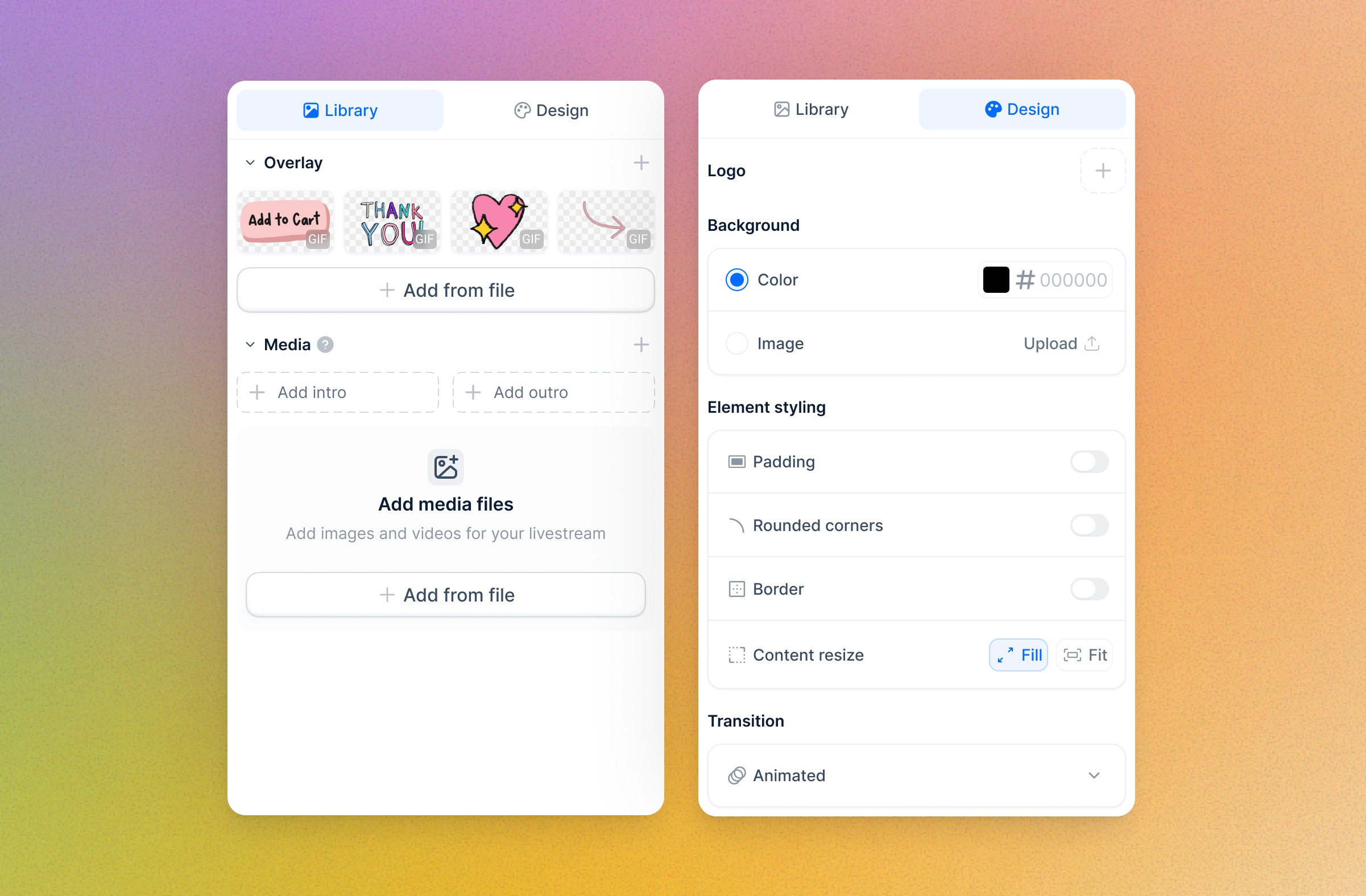
We redesigned the panel into two clear tabs:
Opinionated defaults to reduce decision fatigue
For styling, we simplified controls. Instead of endless numeric sliders, sellers could pick from Small / Medium / Large options for padding, borders, etc.
Why? Because sellers aren’t designers—they just want things to look good fast, without fussing over pixel values.
Before
IMAGE
After
IMAGE
IMPACT
Faster decisions, fewer mistakes, confident live sellers.
From flat upload bin to workflow-aligned tool
Together, Phase 1 and Phase 2 transformed the asset panel into a tool that matched how sellers actually plan and run their shows.
Sellers stopped pausing to second-guess before triggering assets live.
Reordering and purpose-driven grouping gave them a clear run-of-show, reducing on-stream mistakes.
Smart defaults removed the mental load of remembering how each asset would behave.
Styling features—previously buried and rarely used—became a natural part of prep, leading to more polished live streams.
Image description
IMAGE
Ripple effects beyond the panel
This project didn’t just improve one UI—it reshaped how we approached the entire Studio redesign:
The Media vs. Style tab structure became a blueprint for organizing other Studio features.
Role-based grouping informed future ideas like reusable show templates and segment-based asset packs.
Sellers who felt more confident ran smoother shows, which in turn improved viewer engagement and live sales conversion.
The impact wasn’t just about making assets easier to find—it was about reducing friction across the entire live selling workflow.
Image description
IMAGE
What I Learn
Question the question, watch the behavior.
Question the question
The smallest asks often hide the biggest problems. “Can we just show file names?” wasn’t really about file names. It revealed a deeper mental model mismatch that shaped the entire solution.
Workarounds are windows into real needs
Sellers used upload order as a fragile run-of-show. Workarounds like these are never just hacks, they’re signals of missing structure and often reveal the most valuable design insights.
Clarity builds trust, not just efficiency
When sellers could trust the panel to behave predictably, their entire energy on camera changed. Good design doesn’t just save time; it helps people feel in control, even under pressure.