Rethinking Asset Panel Design
From Upload Bin to Purpose-Driven Workflow
My role
UX Lead — Interaction Design, Visual Design, User Flows, Rapid Prototyping
Team
Andrew King, PM
Ryan Odd, SWE
Timeline
1 month • Launched February 2025
Impact
30% faster asset selection
Reduced support tickets
Improved creator confidence
Overview
Live sellers relied on the asset panel to run their shows, but it behaved like a flat upload bin, forcing them to hunt, hesitate, and sometimes trigger the wrong thing on air.
Over two iterative phases, we tackled the most visible pain points with quick fixes like file names and reordering, then rethought the panel around when and how assets are used. This freed up space, made assets more recognizable, and reduced the mental load during high-pressure moments
The result? Sellers could prep with ease, act faster on air, and run smoother, more confident live shows.
PREVIEW
Description
IMAGE
Description
VIDEO
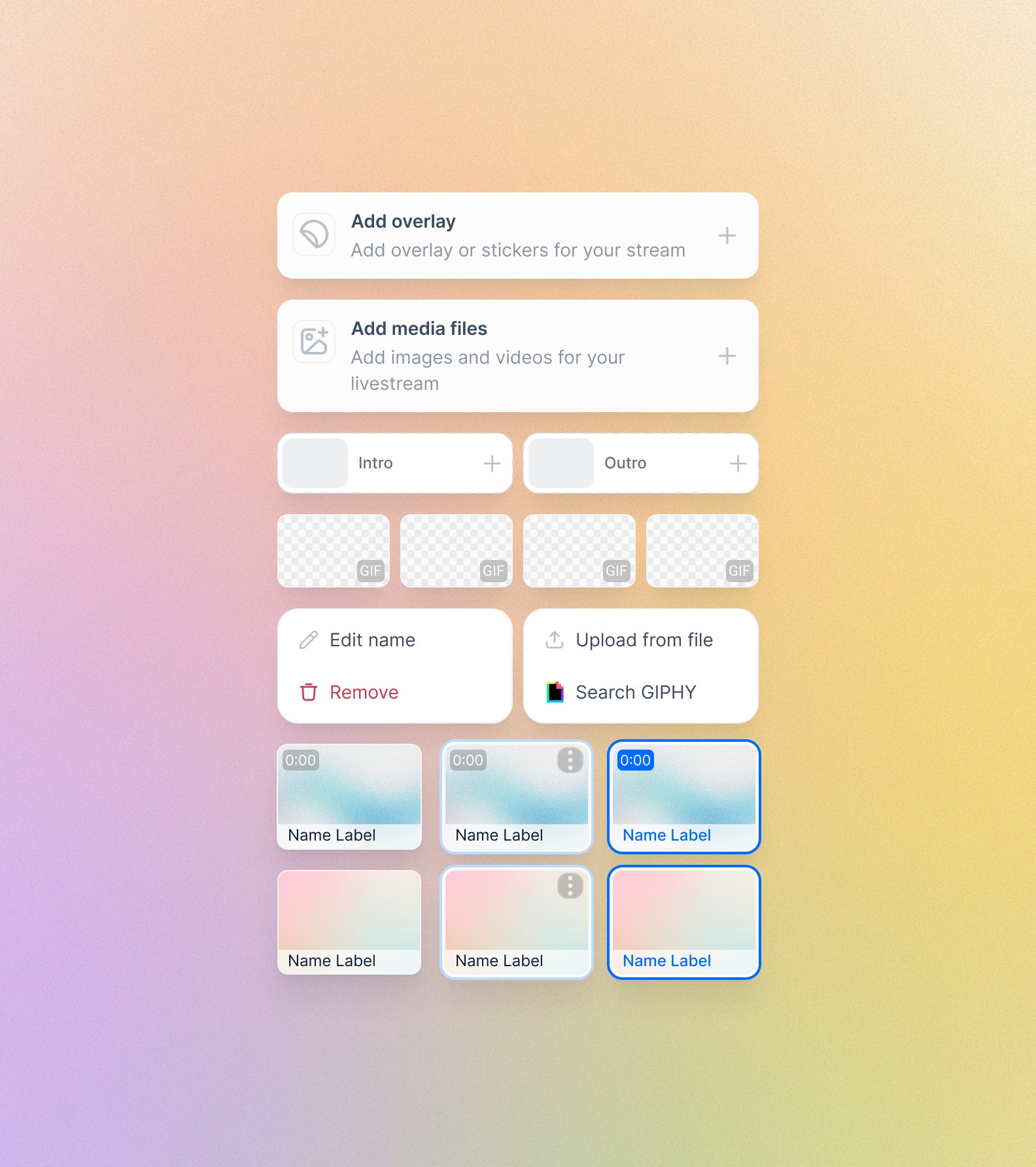
Image description
IMAGE
THE REQUEST
It started with a simple ask.
"Can we just show file names?”
During live shows, sellers are doing everything at once — hosting, showing products, switching scenes, triggering videos and images. The asset panel is where all of that happens.
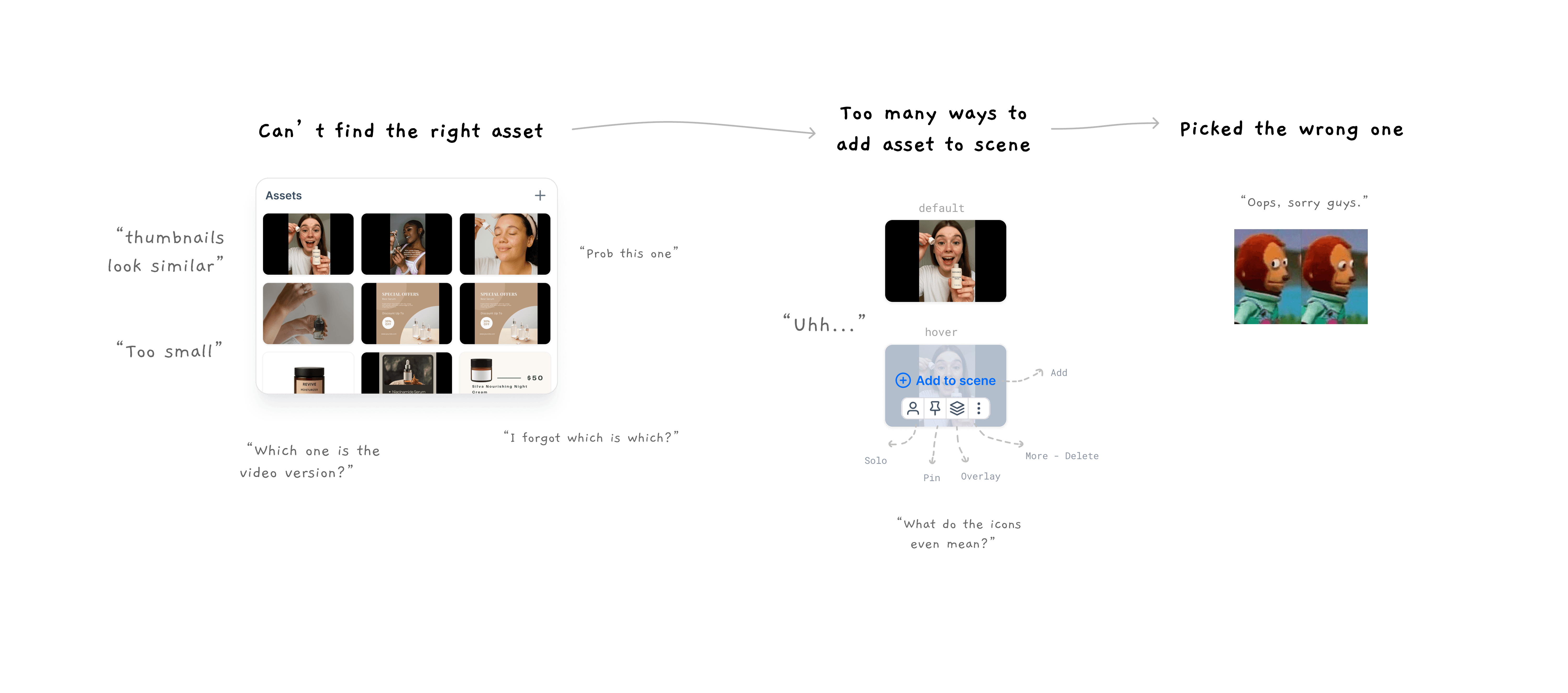
But live sellers were running into the same frustrating issue: during their live shows, they couldn’t quickly tell their assets apart during livestreams. Thumbnails, especially for videos or product shots taken in similar settings, looked nearly identical. And in the middle of a fast-paced stream, those extra seconds matter. They can mean missing the right moment, creating an awkward pause, or showing the wrong thing on screen.
At first glance, it seemed like adding file names will be an easy win.
But the more we looked, the more it became clear: this was just the visible part of a deeper problem.

Description
IMAGE
DISCOVERY
Missing file names were just the tip of the iceberg.
The current asset panel wasn't built for live selling workflows.
Support tickets told us sellers were “losing” assets mid-show. But they didn’t explain why.
We decided to watch sellers in action: joining support calls, reading through tickets, and especially viewing live shows from the audience’s side.
Here's what we saw:
Sellers pausing mid-sentence, unsure which asset to trigger
Resizing the asset section just to make thumbnails big enough to guess what they were looking at.
Often triggered the wrong asset while live
Overwhelmed by the number of ways to bring an asset to scene
Description
IMAGE
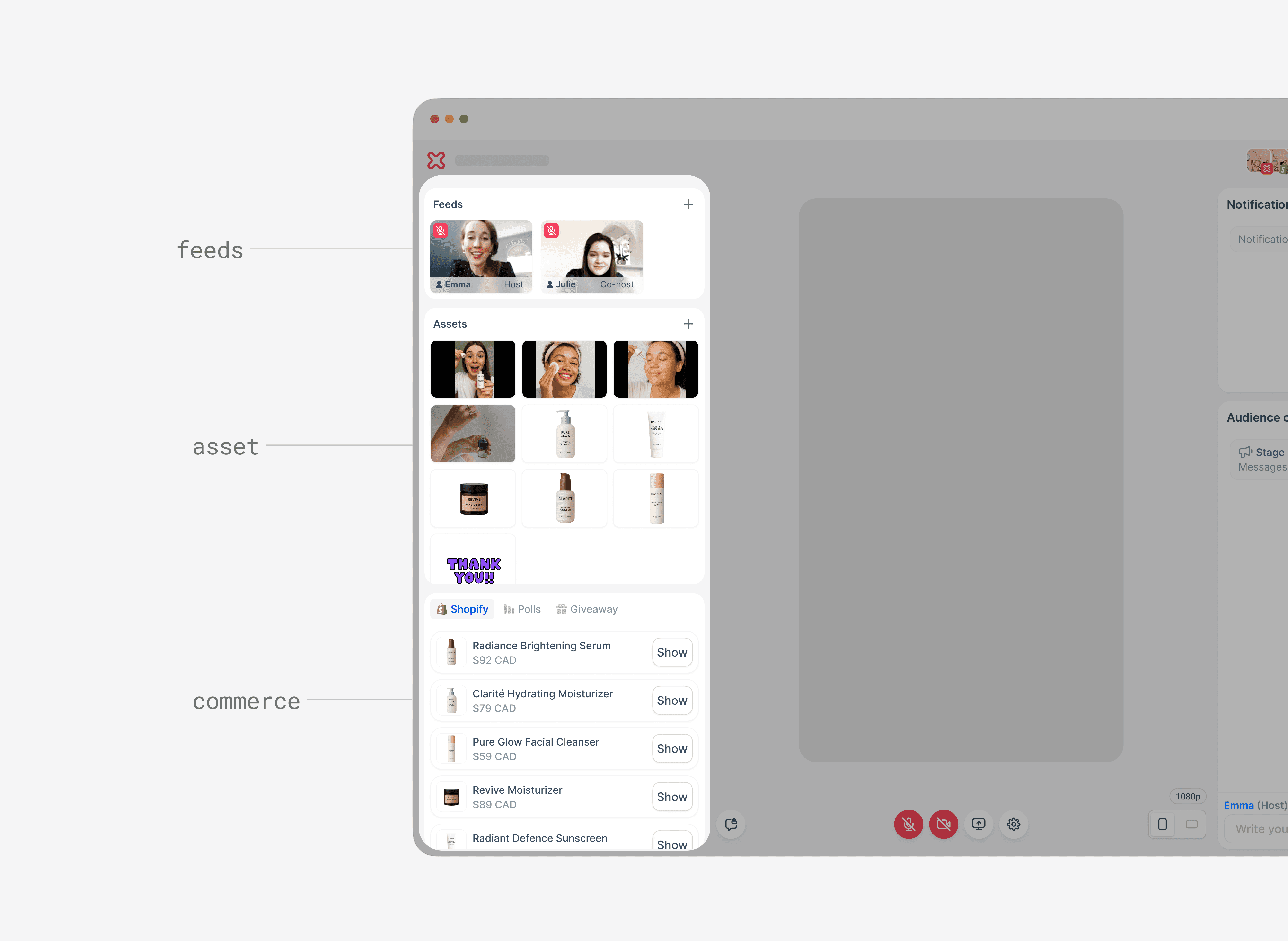
The left panel wasn’t helping. It crammed Feeds, Assets, and Commerce into one narrow space, forcing sellers to scroll and shuffle sections just to reach what they needed.
Description
IMAGE
This wasn’t wasn’t just about visibility—it was about clarity, confidence, and keeping the show flowing smoothly under pressure.
It hinted at a much deeper disconnect between how the panel was structured and how sellers actually think when running a live show.
INSIGHTS
Sellers think in roles, not file names
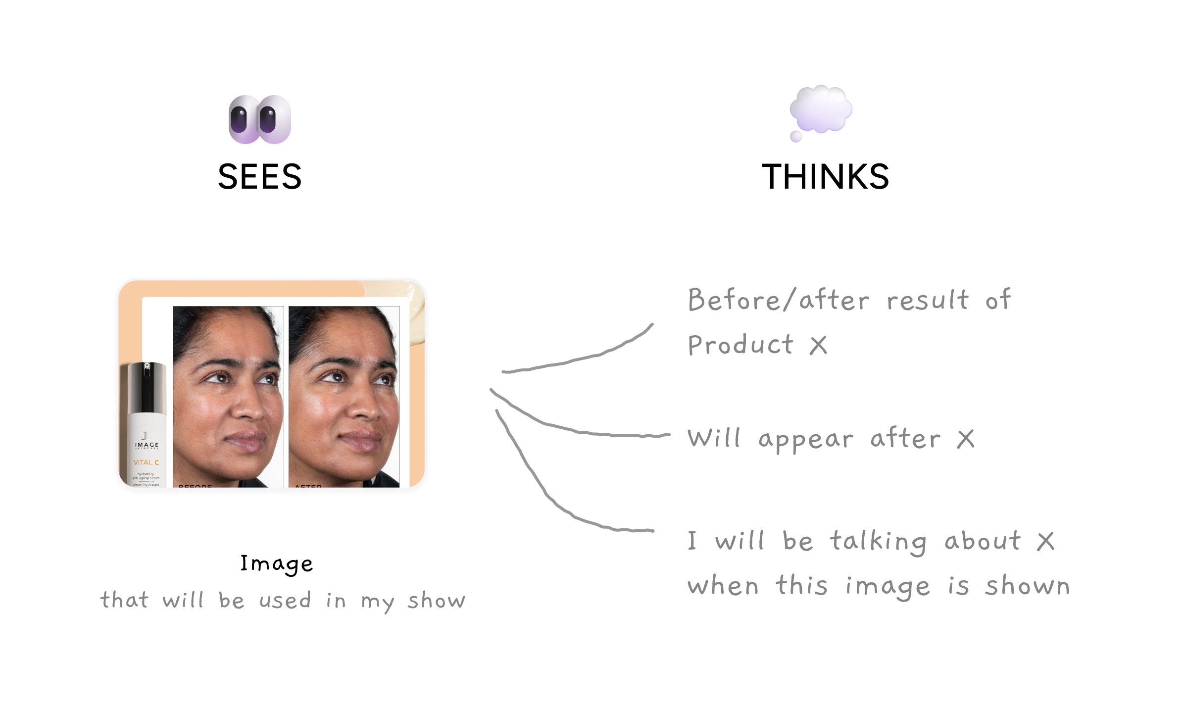
The deeper we looked, the more we saw the real issue: the panel was built like a file library, but sellers run their shows like a sequence of moments.
Sellers don’t think in file types. Whenever they are referring to a file, they say "run my intro" or "show the before/after."
Purpose drives choices. Across different sellers, we saw certain asset roles appeared consistently. Their workflow was built around why an asset existed, not what format it was.
Intro/outro videos
Content clips for demos or testimonials
Overlays for product segments
Branding elements
Upload order as a hack. Without a real way to plan their show visually, sellers relied on upload order as their “run-of-show” — a fragile system that broke if anything changed.
Description
IMAGE
It wasn’t just about giving sellers another way to see their assets.
It was about helping them find the right asset, fast and confidently, in the way that matched how they plan their shows.


SOLUTION • PHASE ONE
The quick fixes
We knew the panel needed to align with how sellers think about their shows. But with limited developer bandwidth and the need to show value quickly, we couldn’t jump straight to a structural overhaul.
Instead, we chose low-effort fixes that eased the top pain points and let us test assumptions with minimal risk. We focused on incremental improvements that directly mapped to the three core friction points we saw from our insights:
See clearly
Organize easily
Trigger confidently
This became the Phase 1 scope: quick wins that would deliver immediate clarity without disrupting live workflows.
Here's what we focused on
File names as a second identifier
Helped sellers double-check they had the right asset when thumbnails looked similar.
Description
IMAGE
Reordering assets
Supported sellers’ mental “run-of-show” without forcing a new workflow.
Description
IMAGE
Impact: Quick wins, clear limits.
The results of the Phase 1 changes were positive, but also revealing: it validated that sellers needed more clarity but also showed us that visibility alone wouldn’t solve the problem. The real friction was cognitive load: sellers had to scan too many similar-looking assets and make too many choices under pressure. Even with careful pre-show prep and clear file naming, the cramped layout and tiny cards still slowed them down.
Description
IMAGE
SOLUTION • PHASE TWO
Designing for live selling, not file storage
With the quick fixes in place, we focused on removing the root cause of hesitation:
How do we help sellers select the right asset instantly, without thinking twice, while they're live?
Free up left panel space - move feeds to its own view
Sellers usually add feeds early in setup and rarely adjust them live, freeing space for the tools they use most during the show
Description
IMAGE
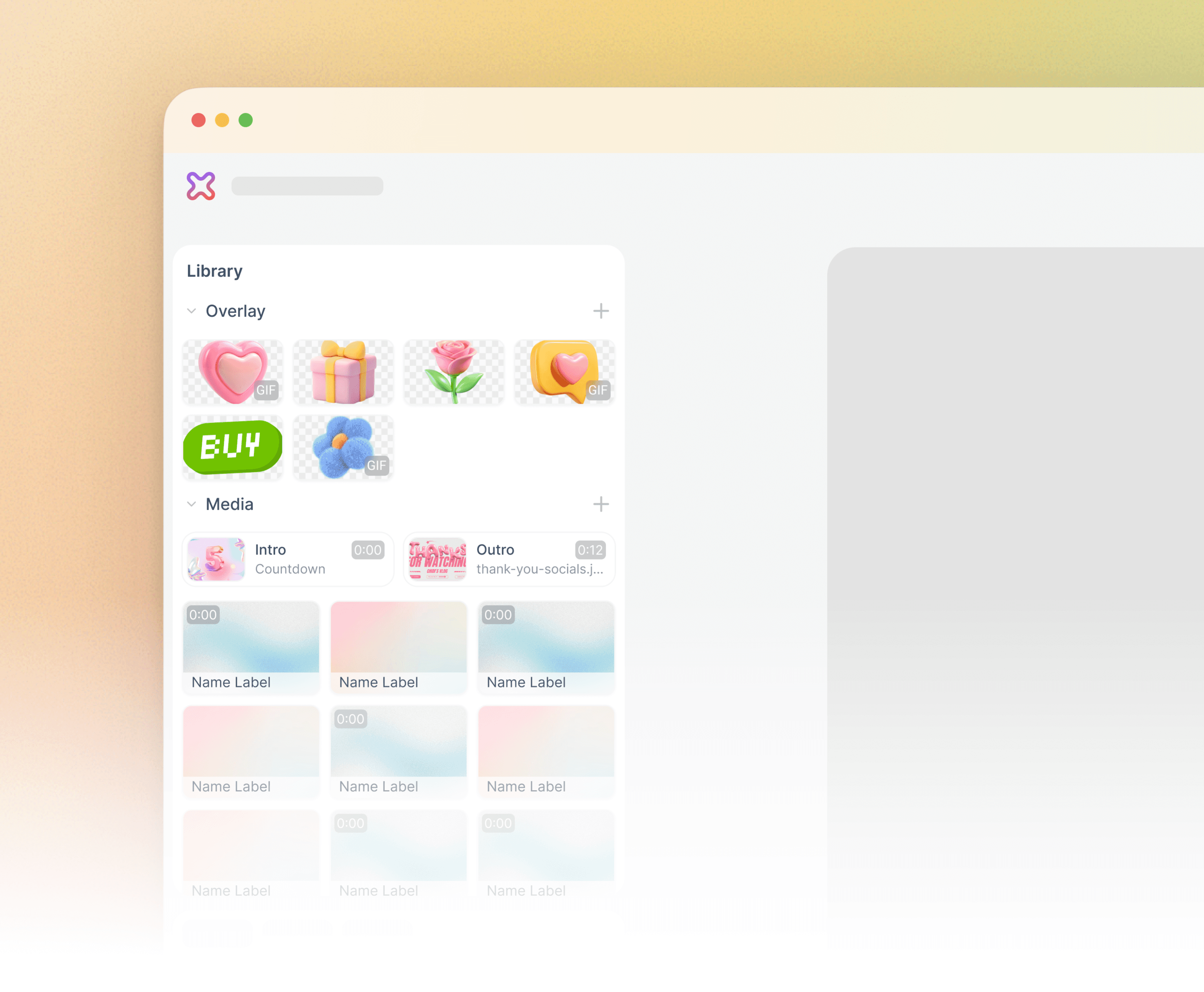
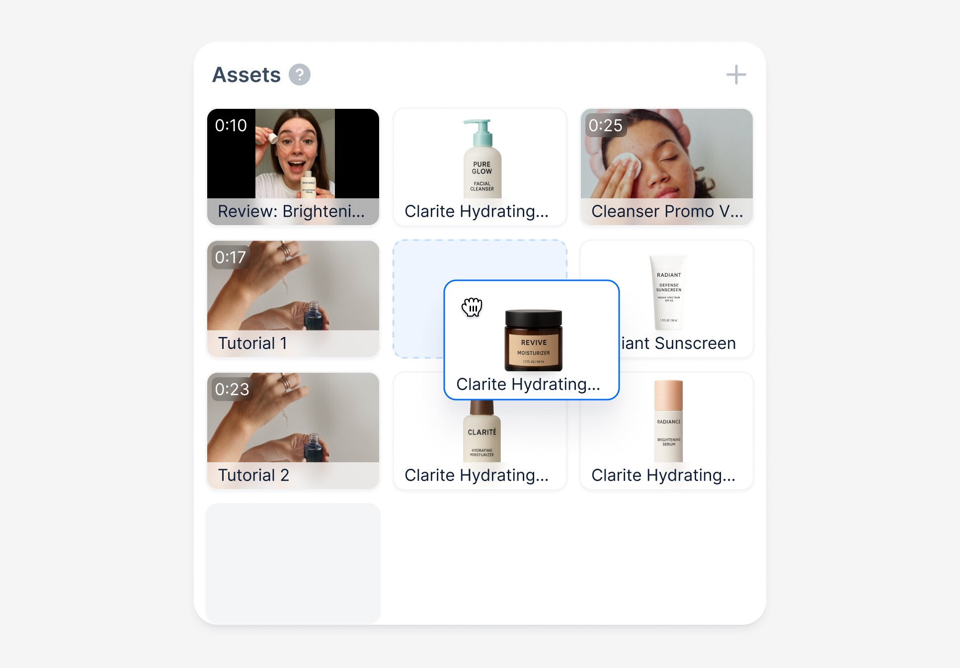
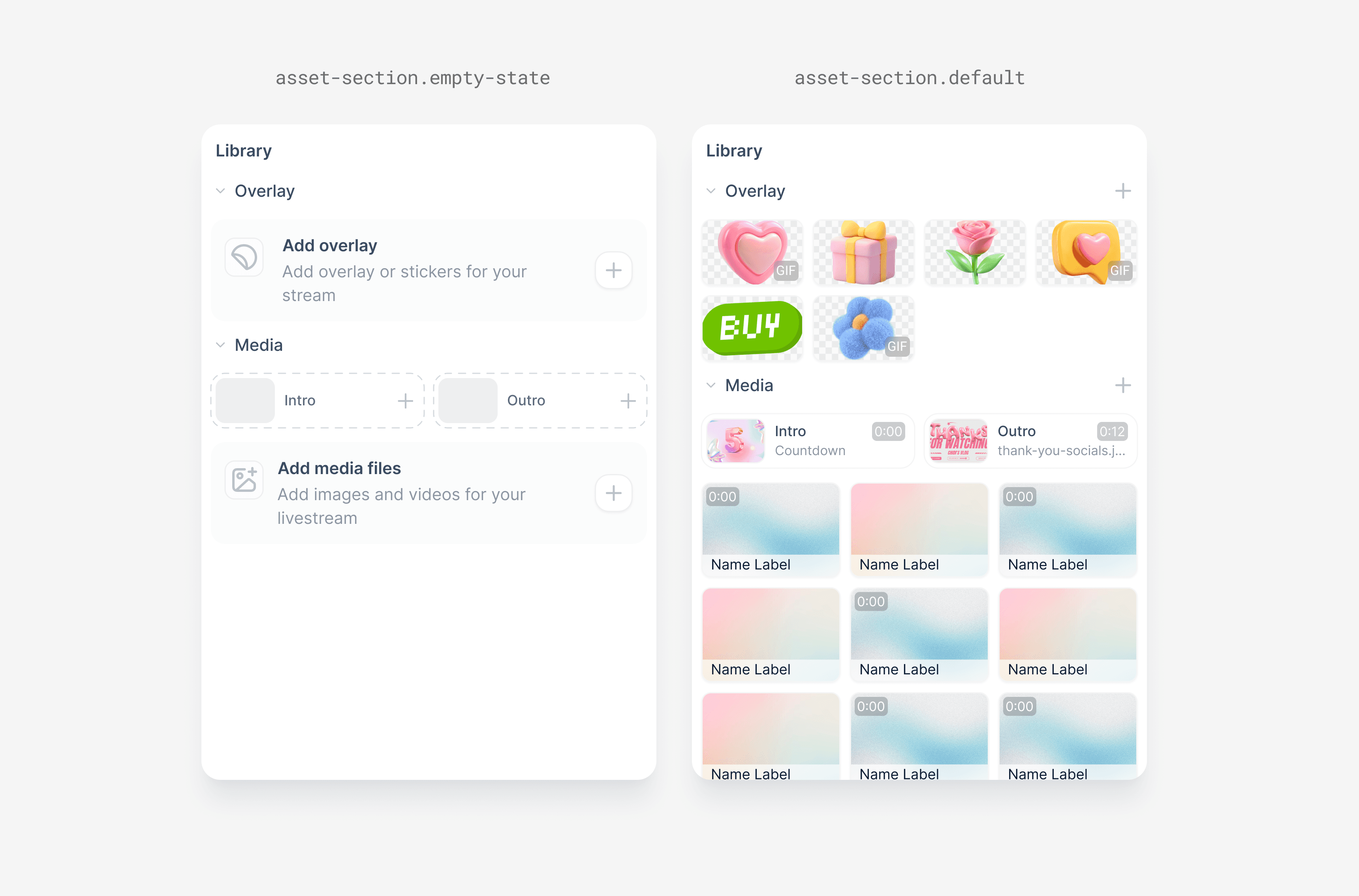
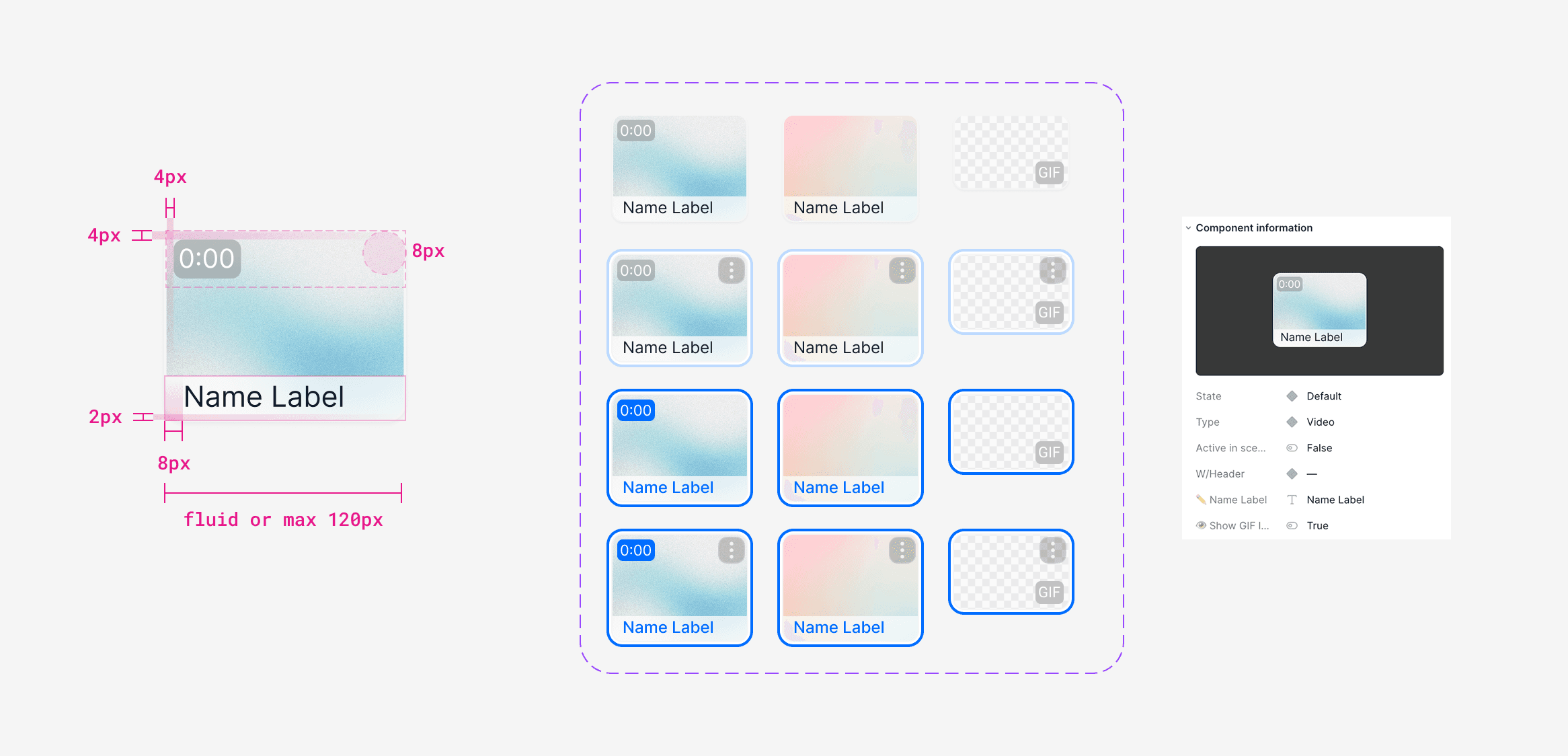
Group by role + smart defaults behaviour
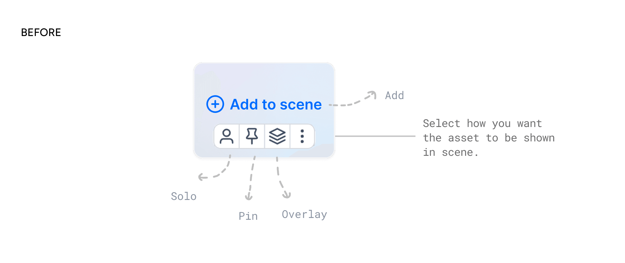
Previously, all assets were lumped into one section, and adding something live meant choosing between four options (Add, Overlay, Solo, Pin), slowing sellers down during live shows.
Description
IMAGE
Now, assets are organized by common types, each with a default behavior that matches how sellers typically use them.
Description
IMAGE
Overlay
Behave like stickers that can be freely positioned on top of a scene, often for decoration or notices.

Description
IMAGE
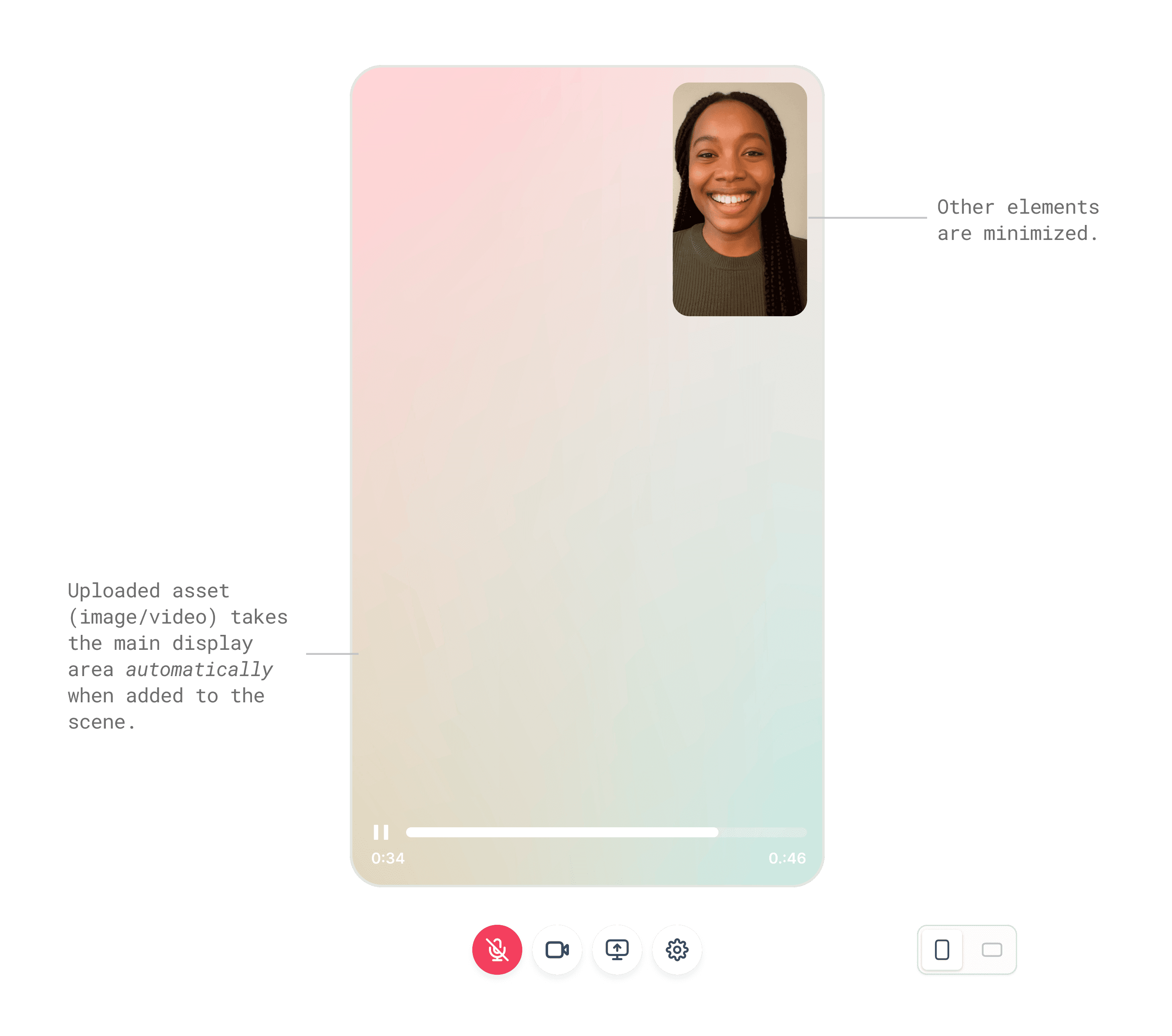
Video & Images
Default to the “Pin” behaviour: take over the main display while minimizing other scene elements, similar to screen sharing in a meeting.
Description
IMAGE
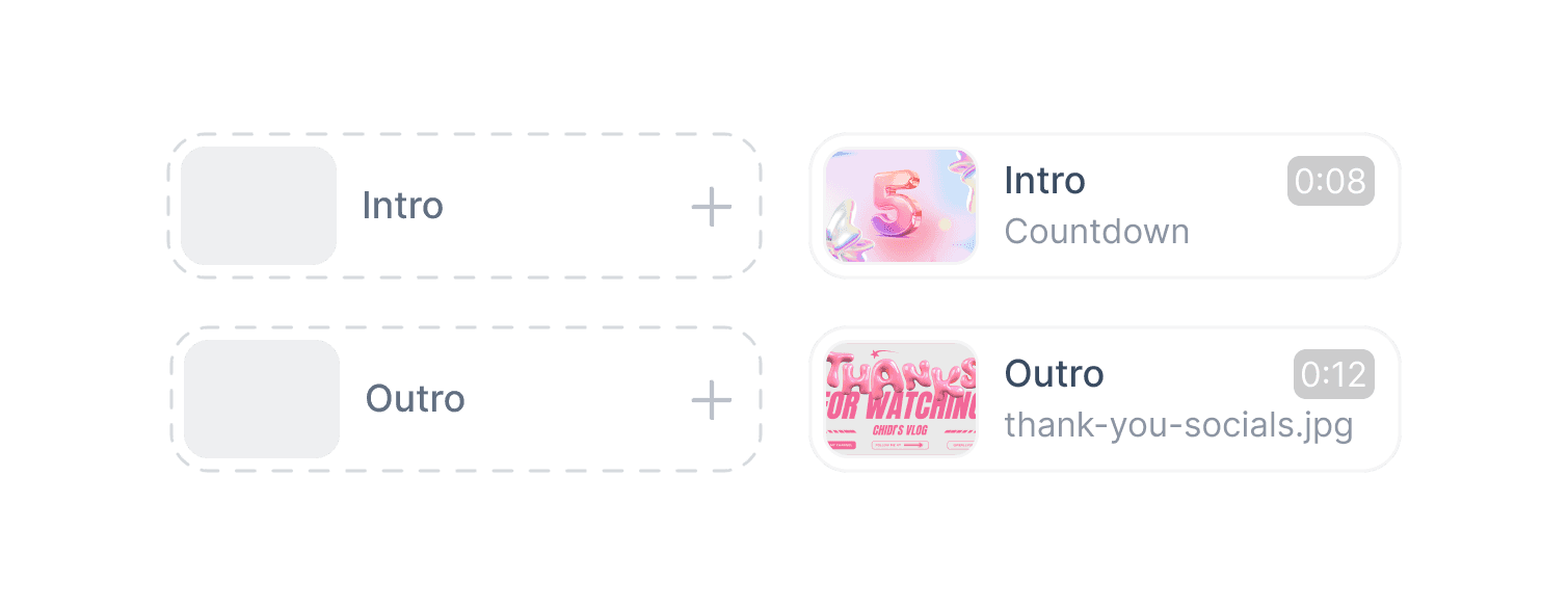
Intro & Outro
Get dedicated slots and display full-screen until manually ended, replacing the old “Solo” terminology.
Description
VIDEO
Description
IMAGE
Quick preview on hover
Show a larger view of an asset before triggering it.
Image description
VIDEO
Description
IMAGE
Description
IMAGE
Description
IMAGE
IMPACT
Faster decisions, fewer mistakes, confident live sellers.
From flat upload bin to workflow-aligned control panel
After Phases 1 and 2, sellers reported smoother shows, less hesitation, and fewer mistakes when triggering assets. While we didn’t have formal analytics, support tickets and live show observation gave us strong indicators of improvement:
40-50%* fewer hesitation & "sorry" moments. Observed in post-launch live streams, sellers triggered assets more decisively without scanning back and forth
Noticeable drop in mis-triggered asset. Complaints about “wrong clip going live” decreased after launch
Faster setup and show flow. Sellers reported feeling “quicker” and “more in control” in feedback calls
*estimated
What I Learn
Question the question, watch the behavior.
Question the question
The smallest asks often hide the biggest problems. “Can we just show file names?” wasn’t really about file names. It revealed a deeper mental model mismatch that shaped the entire solution.
Workarounds are windows into real needs
Sellers used upload order as a fragile run-of-show. Workarounds like these are never just hacks, they’re signals of missing structure and often reveal the most valuable design insights.
Clarity builds trust, not just efficiency
When sellers could trust the panel to behave predictably, their entire energy on camera changed. Good design doesn’t just save time; it helps people feel in control, even under pressure.